Hydration Tour
I created a logotype animation for Lemon Perfect's Hydration Tour using a liquid-blob morphing technique that makes the letterforms move like chilled lemonade. Soft, rounded deformations and bouncy easing give the mark a playful, summery feel, and subtle sloshing settles reinforce the product character.
Creative Director: Simone Cutrí
Graphic Design Manager: Mia Kemme
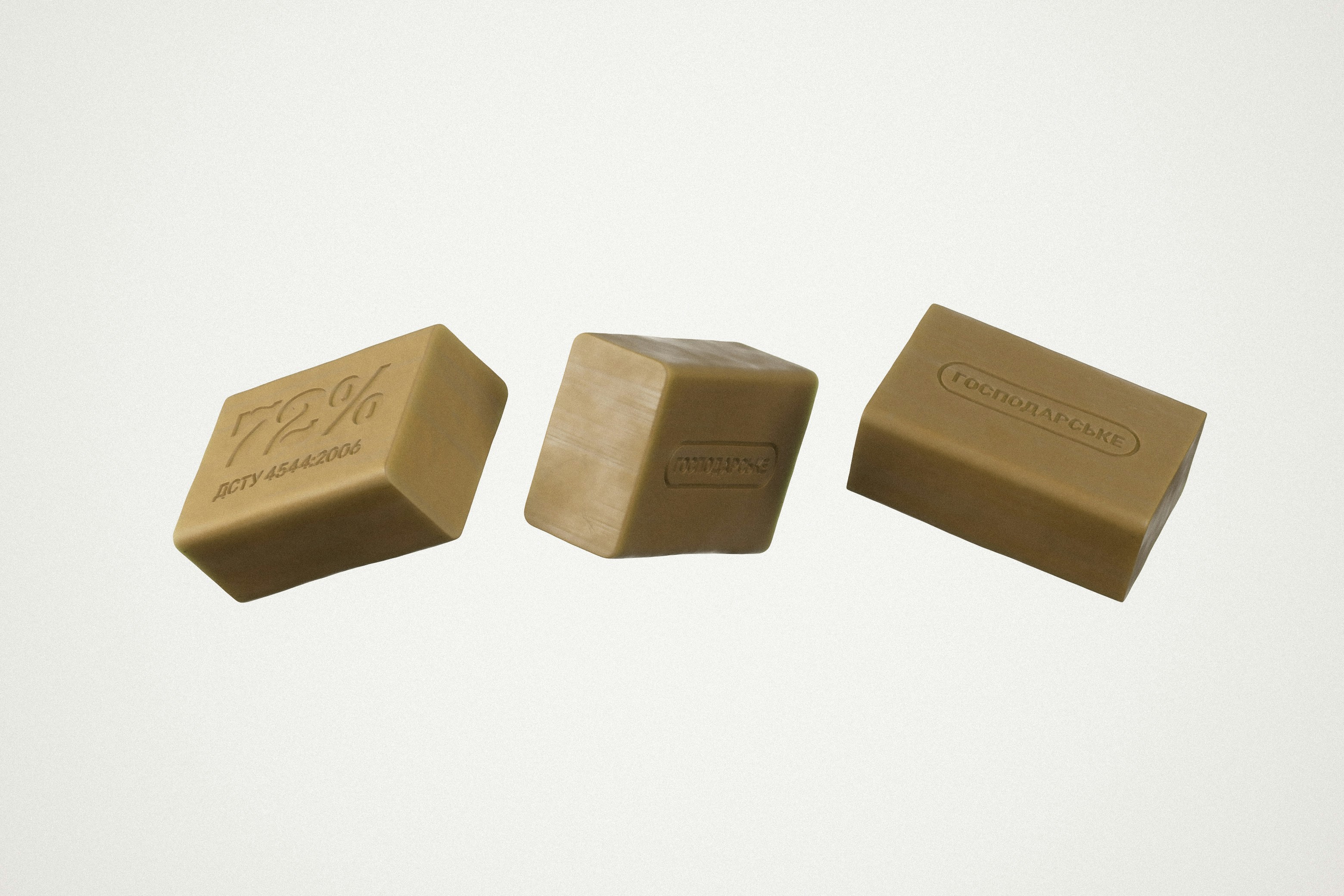
I built the logotype animation around a liquid-blob morphing technique, making the letterforms move like chilled lemonade.
The deformation uses soft, rounded transforms so the mark feels fluid and physical rather than typographic. The easing overshoots slightly, giving the animation a bouncy, energetic quality that matches the tour's tone. At the end of the loop, a subtle sloshing settle reinforces the liquid metaphor and gives the mark a sense of weight that a standard ease-in/ease-out wouldn't produce.
The loop was designed to work on a second pass. The sloshing settle reads more fully once the viewer has seen the full deformation cycle, so the animation plays continuously rather than once.
The animated logomark ran across social and promotional video for the duration of the Hydration Tour without revision, holding up across a nationwide campaign spanning 20+ cities and 30+ tentpole events.